GovMVMT: A Successful Nonprofit Branding and Website Redesign Project
GovMVMT is a national cooperative purchasing program that brings public agencies and top-tier suppliers together, prioritizing ethical standards, public benefit, and value for taxpayers. They serve a wide range of organizations nationwide, from municipalities and utilities to emergency services, public works, and more. They’re a nonprofit working for the greater good—but behind the scenes, an outdated, uneditable WordPress site was seriously slowing them down.
Non-profits and businesses that support government agencies are undergoing significant modernizations—but many still rely on outdated software, processes, and branding.
The old GovMVMT brand didn’t fully capture the impact of their work, the hard coded legacy WordPress site was impossible to update in-house, and they both fell short on accessibility standards. Combined with sluggish plugins, file bloating, and an old-school editing process, it was time to bring in a website redesign agency with a new approach.
Meeting the Unique Challenges of Nonprofit Brand Identity, Website Branding, and Design
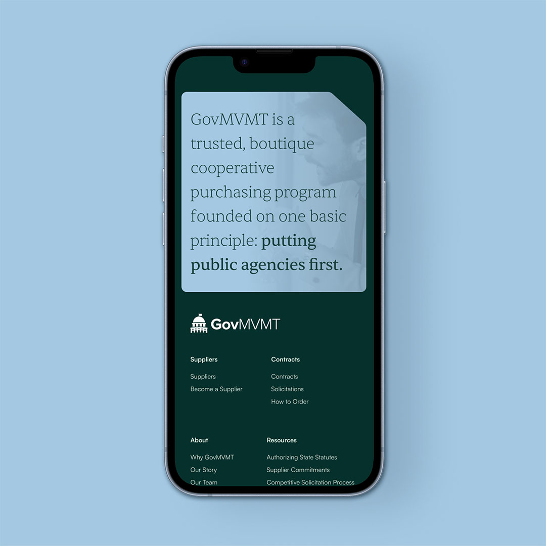
A comprehensive market and brand analysis was conducted by NBD to address the challenges GovMVMT was facing, both internally and in its sector at large. Brand identity services including research, discovery, audience analysis, and market analysis were employed to develop a modern brand that stands out from competitors and upholds GovMVMT's mission and core values. In its new branding design, GovMVMT was intentionally positioned as a modern and forward-thinking entity to ensure its future success.
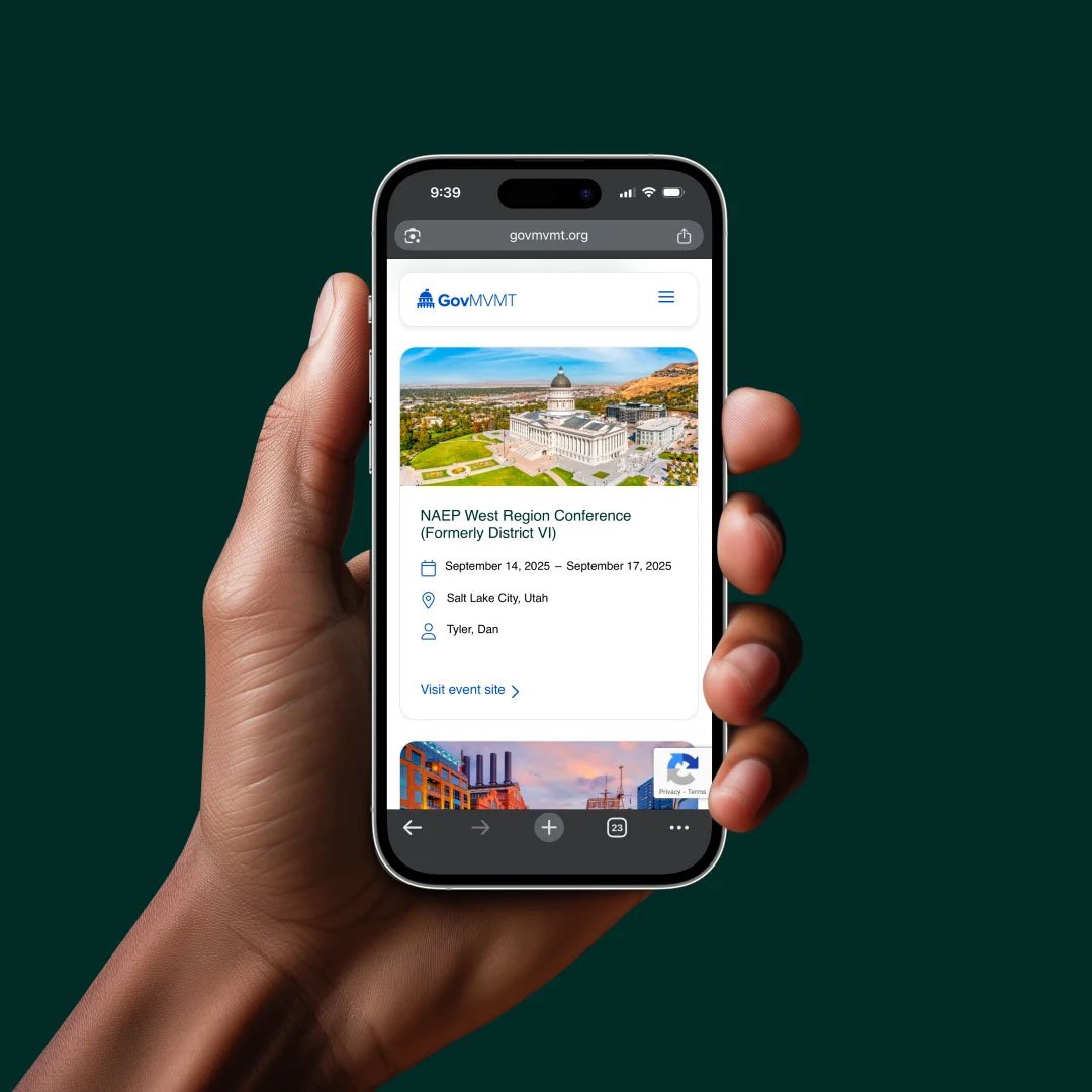
The end result? Improved design and user interface that clearly communicates what GovMVMT does and generates more leads.
Working together, NBD and GovMVMT optimized the website for client usability, email sign-ups, and aesthetic appeal through website development, from fine-tuning the organization’s mission statement to updating their visual identity—including a nonprofit logo redesign. Along with brand guidelines documents and a curated library of photography, icons, and graphics, a reusable website template was provided so staff could make updates in-house. NBD’s redesigned websites always come with documentation, training, and support for the site launch process.
Looking for a WordPress design agency to help you with your own website project
We’ve got you covered. Click through below to get a free quote or schedule a consultation.